

Figurative reference and its application in style
- Sophia Kathermes

- Oct 6, 2025
- 3 min read
In our article examining men's appearance, we came close to one of the style aids—the imagery guide (imagery solution/style space/personal aesthetic—whatever you call it, the meaning is the same). Today, I'll tell you a little more about this tool.
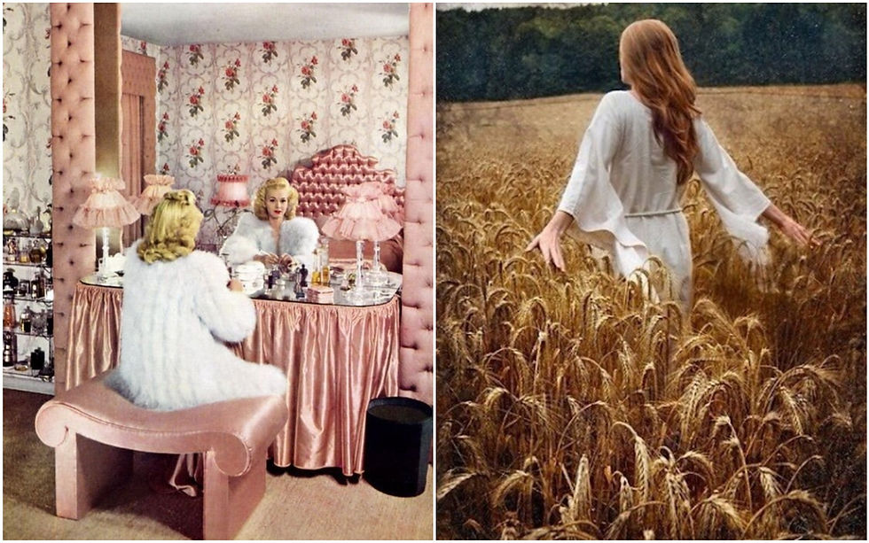
A figurative reference is a stable, vibrant image, from a stylistic perspective, that conjures up in our imagination when we hear it mentioned. "Rococo"—and we see pastel colors, an abundance of detail, pastry dresses, and pale skin with a deliberate blush. "Provincial Italy"—and suddenly the scent of freshly picked lemons fills the air, the sun floods cozy, flower-filled streets, and women are dressed in scarlet dresses. "Nymph"—weightless, flowing fabrics enveloping soft pink shoulders, shimmering waves of hair, floral motifs in accessories. There are countless examples, and this image will be unique to each person, since the key to a well-chosen figurative reference is that it should resonate with the person both externally and internally. Stylistically, this implies:
appearance colors (coloring)
archetypes (human motives: leading and temporary)
Let's take a look at the example of the hero of our previous article:

During the analysis, we determined that the young man possessed the following characteristics:
Color: Cold Summer (cold, muted)
facial linearity - Solid shape + Languid line
Personality Types - Sensual/Refined
Archetypes: Mage, Seeker, Rebel So, let's take a look. The Cold Summer palette is there. The stronghold of rocks, castles, and statues is there. The turbulent ocean and sails fluttering in the wind serve as the Sluggish Line. The historicity and thoughtfulness of the location are for the Refined OT, while romantic mists and natural textures are for the Sensual. And all this, of course, is for the Mage-Seeker-Rebel pairing. They set the mood. Change the archetypes—and the scenery changes.
Transferring this to everyday looks: A palette of a stormy sky over the ocean—yes (excluding black in such large quantities) + the use of gradients. Solid form in thick, form-fitting fabrics, shoes, and voluminous accessories. The same applies to pronounced "stone" textures. A languid line in soft, draped fabrics, when striving for a more romantic look. Following the recommendations of the Image Types, we favor the relaxed layering of the Sensual in everyday looks and the historicism/vintage of the Refined in formal business looks. The archetypes suggest possible stylistic directions—grunge, urban, military/safari, and ethnic details.

You see a thing and imagine it in the context of your image - that's how it works.
Almost all of the images presented are, of course, too theatrical for everyday wear, but this makes it easier to feel and convey the desired aesthetic. For a more appropriate look, it's necessary to tone down the expressiveness slightly.
As I wrote earlier, visual cues aren't for everyone. And that's neither good nor bad. It all depends on your thinking style: some people find it easier to follow clear, technical guidelines (knowing the linearity, body type, and color scheme is enough), while others need a "picture in their head."
Image types are essentially a basic version of personal imagery guidelines. Using them as a foundation, you can delve deeper if your heart desires. Work on linearity. Develop a palette. Incorporate archetypes to narrow recommendations and enhance the experience. It's a creative and engaging endeavor, but everyone decides for themselves whether it's worthwhile.
I hope this article helped you answer this question.
Peace between the outer and inner to each and everyone!
Thank you for your trust, and until next time!


Comments