

Stylistic analysis of appearance from 02.02.2020
- Sophia Kathermes

- Oct 7, 2025
- 5 min read
Greetings, dear fellow travelers!
No matter the goal of your style search—whether you want to create your own vibrant character that reflects all facets of your soul or project an image that will foster career advancement—you'll need a solid foundation of facts about the potential of your appearance. Otherwise, you won't achieve a harmonious image, and that's precisely why we're all gathered here today.
In building this foundation, we are aided by a stylistic technical analysis—a derivation of those appearance characteristics that are difficult to ignore: color type, linearity, and image type. With this analysis of a bold and beautiful female volunteer, I would like to once again illustrate the importance and accessibility of defining these characteristics.
Let's start, traditionally, with the color type.

Color type is determined by key characteristics (warmth/coolness, lightness/darkness, brightness/softness) and further verified using collages. If you lack visual experience, you can test all color types using collages, but we'll focus on a few borderline ones.
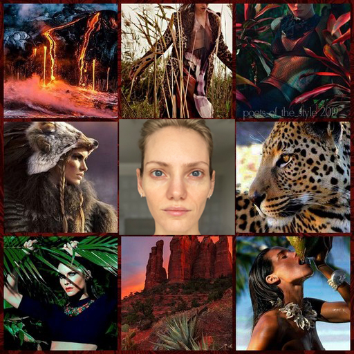
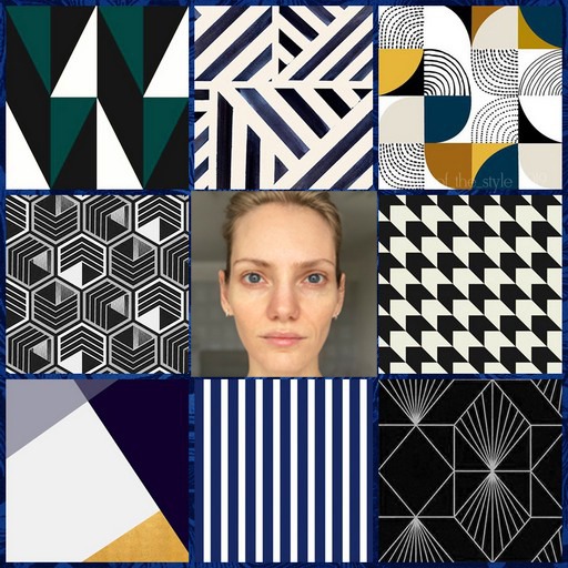
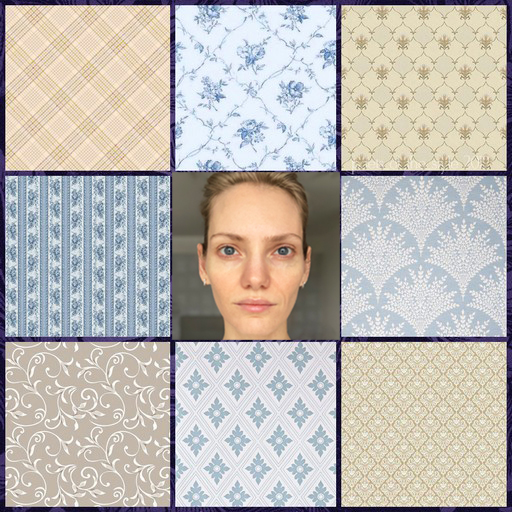
Let's take a look at our beautiful girl. First, of course, we create a palette of primary colors using the website color.adobe.
What are her colors like? Definitely not dark. More like light. The temperature range is questionable, so we're ruling out cool and warm colors, followed by dark ones. The remaining options are Light Spring and Summer, Bright Spring, and Soft Summer. Let's take a look:


Bright Spring - Light Spring - Light Summer - Soft Summer
So, first of all, it's clear that the leading characteristic of our heroine's color type is lightness. It's precisely when surrounded by light palettes that her skin begins to glow. Soft Summer falls short, while Bright Spring overpowers it. Among the light colors, choosing is a little more difficult. Which characteristic would you rank secondary after lightness? Cool/warm, bright/soft? We see brightness, i.e., a purity of color. They don't look dusty, which is typical of summer colors. There's no haze or veil. Warmth also slightly prevails over coolness—against a bright summer backdrop, skin begins to look yellow, and the thin skin under the eyes reveals blood vessels. However, this option is also possible with the help of makeup, but we are looking for an environment that creates its effect) An interesting note - the Bright Summer collage suits our heroine's mood better and it is difficult to abstract from this - air, lightness, fragility, tenderness, glare... we put all this in a mental drawer for subsequent stages of analysis.
And the first step toward harmony has been taken: our enchantress's color scheme is Bright Spring. Let's move on.
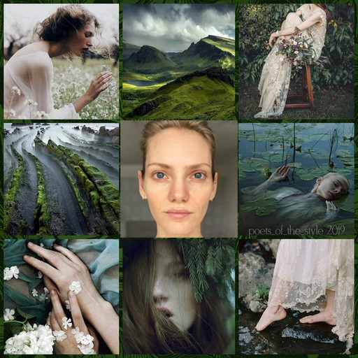
A brief introduction. Everyone knows what a color type is and understands its purpose (or maybe they don't, but they accept its significance on faith). The topic of linearity is touched upon much less frequently, but it's no less (if not more) important. Once you become familiar with it, you stop dividing passersby into attractive and unattractive—they've either managed to adorn themselves with the appropriate frame, or "something went wrong." And almost always, the "wrong" lies in incorrect linearity, because beauty, as we know, is in harmony, and for this, the lines of the image must echo the lines of the appearance. Let's begin by looking for the lines that were intended to adorn our heroine.

We turn on our visual thinking and glance at the face. What do we see? Do we see volume (that is, shapes) or just lines? Should we sculpt the face or draw it? Or maybe sketch it?
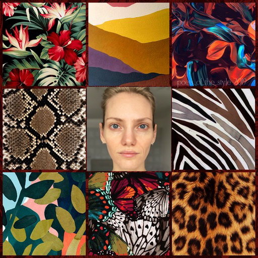
The facial structure (bone structure and soft tissue) is definitely well-shaped—voluminous and streamlined. The fullness of the face is still questionable. I'd also immediately rule out relaxed lines (Soft, Smooth, and Flabby), as the features don't clearly droop. Whether they are static or tense will be revealed in the collages:


Aggresive - Elastic - RIgid - Solid - Elastic - Fragile
Let's consider the impression our heroine makes when surrounded by different lines. We immediately want to rule out tense lines (aggressive, flexible, and elastic)—there's no sense of urgency in the facial linearity. However, a subtlety reminiscent of aggressiveness is present, but the mood is entirely different. What remains is static. Next, we rule out the Hard line—it's excessively sharp and flat. Among the shapes, the Hard line, of course, leads the way—a noble monolith is felt in the features. It's complemented by the Fragile line—thin, intermittent, and delicate (like those very sugar crystals in the Bright Summer collage).

In summary: The Fragile Line complements the Solid Form, and it turns out that various crystals (solid, but also transparent and with fine charcoal) can be an excellent guide for our volunteer in choosing silhouettes, fabrics, and textures. Solidity favors static, streamlined silhouettes (without sharp angles), shape-holding fabrics, and dense fabrics. Fragility can be expressed in accessories, short diagonals, fabric textures, and prints (transparency, glossy/satin textures, charcoal lace).
The tale is soon told, and we've reached the final part of the technical analysis:
A personality type, to put it simply, is your attractiveness, your sex appeal, that vibrant image you project to the world with particular ease and can fully express by following these guidelines. This is your role in our life-theater.
How do we determine the role of our beautiful maiden? We can base our analysis on the characteristics we've already identified, examining and correlating colors and lines with character types, but the simplest and most effective method is collages with a corresponding aesthetic. We examine and search for the "best role," first eliminating character types with a naive component (Tender, Doll-like, Cheerful, and Daring), as its absence is unmistakable:


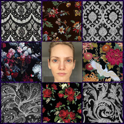


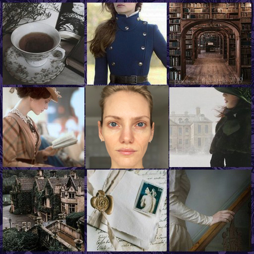


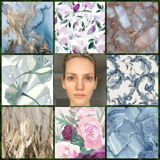
Savage - Mystery - Imfluentinal - Manor - Exquisite - Sensual
There's also no doubt that romanticism is the dominant feature in our heroine's appearance—a sense of extraterrestrial origin is impossible to ignore. This isn't our time, this isn't our reality. For this reason, we're eliminating all the "down-to-earth" types—the Influential, the Wild, and the Local. Well, the only thing left to do is choose a complementary style. Let's think in terms of impressions. What is our heroine like? Does she possess classic restraint or a natural, natural, and welcoming nature? Or perhaps a strong and noticeable sense of drama? Even the types we've already ruled out show that there's a dramatic element. This is also evident in the physical portrait. Drama is always excessive, and our wonderful woman's face is extremely expressive. Therefore, we're eliminating the Refined type as too reserved. Smooth skin texture, crystal-clear eyes, the charcoal-like quality and detailed delicate lines—all of this leads us to the Mysterious, but the color type and monolithic Hard Line add a natural touch. Therefore, in our heroine's case, some adjustments are required—a fusion of two Imagery types. We slightly "cool" and "lighten" the Mystery, adding a touch of naturalness and airiness, while we complicate the Sensual, adding a touch of royalty and gloss. Remember, our associations are with magical natural crystals, not faceted gemstones.

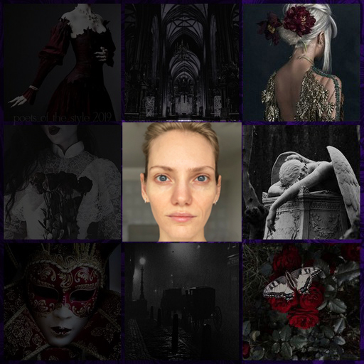

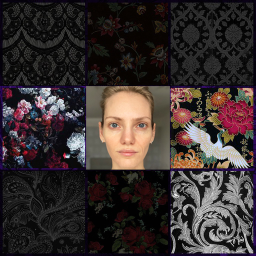

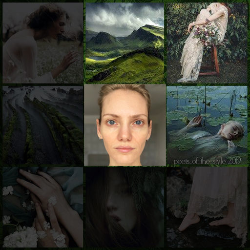

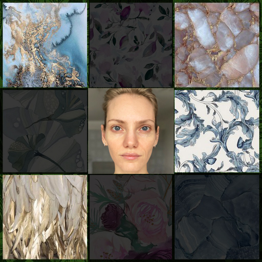
Image types with adjustments
All this brings to mind thoughts of elves of noble blood, living in palaces, but in complete harmony with nature.

Possible figurative reference
That's all for now, dear fellow travelers. I hope you found this analysis useful and inspiring. I'm also always happy to receive volunteers for a similar public analysis under special conditions.
Peace between the outer and inner to each and everyone!
Thank you for your trust, and until next time!


Comments